Showing posts with label colour sketchbook. Show all posts

Monday, 19 September 2011

Sketchbooks and Cupcakes

As summer draws to an end so have my sketchbook tutorials, although I hope everyone who has been joining in over the summer will continue to work in their sketchbooks.


At the weekend I had a chance to join in a day class with Jan Beaney at our Embroiderer's Guild and it seemed a good opportunity to develop some of the images from my summer sketchbooks.


These photographs and quick sketches of daisies from last years work, had led to the monoprint collage below in this year's red themed book, which I though might translate well to an embroidered panel.


Jan was teaching a technique of creating a personal cloth by working onto a surface of water soluble fabric. (I should say before I forget, she was a excellent and entertaining teacher.) So I combined the layout of the monoprint with the colors of the photographs and came up with this panel below.


Layers and layers of both machine and hand stitch built up to create a dense fabric...


With a few beads thrown in for good measure.


It is still very much a sample at this stage but I think it could have potential to develop into a larger panel.
One of the questions I often get asked is how can sketchbook work be developed into finished pieces and there is no one simple answer. The point which I hope to illustrate here is that the more you work in sketchbooks and the more you work samples, the better informed your work becomes.


Other news here... I finished my final panel for the ERTF exhibition in Norwich... but I'm keeping it under wraps until the exhibition opens so you'll have to wait until next week. I've also received rather a lot of parcels in the post too... just look at all these cakes that have arrived already for my Pink Friday Party... and it's still over a month away! Of course my excitment was dampened somewhat when certain male members of my family pointed out the irony of raising money for Breast Cancer Care with knitted cakes that look remarkably like breasts!


There have been real cupcakes too (not that they deserved them) ... coffee and walnut though... I couldn't face pink cakes with cherries!

Tuesday, 30 August 2011

Colour Sketchbook :: 7

I took my sketchbook away on holiday.
Up until now we've been working on stencilling, printing etc using images taken from close to home but working in our chosen colour - in my case, red, ignoring the local colour. By local colour, I mean the colour that we actually see e.g. sky is blue, grass is green etc.
So on holiday I took a different approach and I concentrated on the local colour and drew what I could see that was actually red.

I had a fairly limited range of materials - some drawing pencils, some watercolour pencil crayons and a paintbrush, yet I managed to capture some of the different reds ranging from scarlet to pink to magenta that could be seen in the beautiful gardens around our hotel.


These are not particularly skilled drawings but the point is to capture the shapes and the colours as best as possible to allow for further exploration on returning home.


So if you are still working along, take time this week to look around and see what you can actually find around the garden or the house in your chosen colour. And if you really can't see anything, compose a still life to draw. Try a collection of objects such as buttons, fruit, cups... anything you like.


Remermber, don't get bogged down with producing an accurate masterpiece - just think about the colour and the shapes... and fill up the page, go over the edges, have fun!

Tuesday, 16 August 2011

Colour Sketchbook :: 6

Another technique when monoprinting is to use resists. These can be anything such as torn strips of paper, cut paper shapes or one of my favourites - plant material or leaves. Ink up the plate as shown in the previous tutorial and lay your chosen resist on the surface. The red colour of these leaves led to me chosing them.


Lay a sheet of thin paper on the surface, covering the inked plate and your resist. With a clean roller, press hard all over the surface but without disturbing or moving the resist.


Carefully lift off the paper and you should have a dramatic silhouette print.


The next stage can only really be done successfullywith plant material/leaves with a distinct texture and markings - lift off the resist, re-ink the plate and lay down the resist again but this time inky side up.


Repeat the process with a sheet of paper and a clean roller and this time you should get a wonderful detailed print.


Of course by now you will have a stack of prints, some more successful than others and are probably wondering what to do with them, so I thought I would show you how some of mine have ended up in my sketchbook which I hope will give you some ideas.


This smudgy looking print from last time actually looks a lot better in the photograph (which I quite like) than in reality, where it is very indistict. Even with the addition of colour it is very murky... the photo was taken with it held up to a window and the light brightens it. On the page it looked dead and the colours didn't show at all.


So I added more colour, which made it darker still, added some bleach (there is a tutorial for this in last year's sketchbook posts) to lighten parts and finally some black pen to emphasise other areas.


The resulting image was cut and torn out and stuck in my sketchbook.


The ghost print from last time also didn't excite me very much... again it looks better in the photo than reality.


 So the addition of some colour emphasised the shapes


The print below was another where the actual print disappeared into the background making it look indistinct.


So this one was simply cut out and stuck down onto the white page which is a big improvement.


The print below is one of my favourites and has been simply enhanced with the addition of some carefully placed colour.


And this last one has been a combination of a couple of prints, both given a simple colour wash, cut out and overlaid and stuck down.


I think the point is to keep playing. Even if you don't like an image, add colour - I have used inks, water colour paints and water soluble pencils, add bleach, tear them up, cut them out, combine two or more images and stick them down... the ideas are only limited by your imagination and there is no right or wrong way of doing any of these things. Don't be afraid of making a mess or "spoiling" your work.

Sunday, 14 August 2011

Colour Sketchbook : : 5

As promised, some monoprinting. For those new to the technique it is a simple method of producing a "one-off" print or image from an inked plate. Because it is necessary to work quickly the prints have a lovely textured, painterly quality. You will need to assemble some basic equipment and clear a space on your work surface.

 
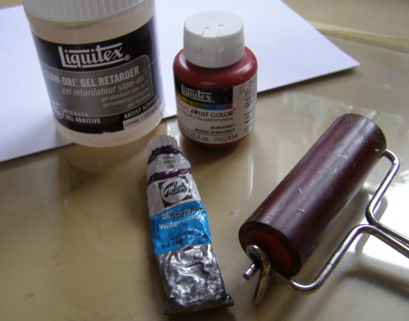
  1. You will need a flat surface onto which you will apply the ink. Ideally this should be a sheet of glass or perspex, although you can achieve good results by using a plastic document wallet. This is your plate.
  2. You will need a printing ink or acrylic paint. For easy cleaning, water based media are best but they do tend to dry very quickly. If you are using acrylics you can buy a gel retarder which slows the drying time a little but the fact that everything dries quickly means it is necessary to work quickly which gives lovely spontaneous results.
  3. You will need a roller - this is essential.
  4. Finally you need a stack of thin paper. It is important that it is thin and I find cheap copier paper is fine.

Put a small amount of your print medium at the top of your plate. It is important not to use too much or you end up with a very splodgy print.


Using the roller, spread the ink into an even layer over the surface of the glass.


You will know it is ready when it sounds sticky (not easy to show in words and photos!). If the roller is sliding then the ink is not spread out thinly enough.  When it is ready you need to drop a sheet of paper onto the surface without applying any pressure. Finger marks will show up on your print!


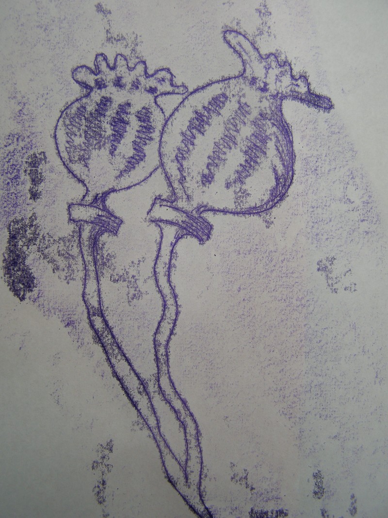
Using something with a sharp point (I find a biro works really well), draw your design on the reverse of the paper without resting your hand on the paper. Only the tip of the pen should be making contact. This gives an element of "lack of control" which I think adds to the quality of the print. If you are not confident about drawing, you can trace around a photograph or simply make patterns or marks.


When you have finished gently lift the paper off the glass sheet and all being well you should have your first print. Sometimes they come out indistinct or a bit blotchy as a result of either too much ink or of being too heavy handed but with experience you can learn to gauge how much ink/pressure to use.


You then simply ink up your plate again... and make another print!


This shows how your print is the reverse of what you have drawn.


There is nothing to stop you adding a second colour ink to the plate if you want. Just remember to keep working quickly.


Sometimes, after taking a print and before re-inking the plate you can get a second "ghost print". After making the image above I quickly laid a second piece of paper onto the plate and gently rubbed over the surface with my hand.


And when I lifted it off I had a print of the marks made where the ink had lifted off the plate for the first print, creating a negative image. This doesn't always work as it depends on the amount of ink left on the plate.


You will get to the stage where everything starts to feel a bit sticky and the prints become very blotchy and this means the ink is getting too dry and you need to clean the plate and start again. The image below is one taken when the ink was a bit too dry.


But I rarely throw a print away and I've rescued this one with some added water colour once the print was dry. The beauty of this process is that for an hour or so working you end up with dozens of images which can be worked into, cut up, painted over with your chosen colours (I've not forgotten this is meant to be colour themed) and then stuck/collaged into your sketchbooks and I will be back with some ideas of how you might do this as well as some more monoprinting ideas.


And when it comes to cleaning up... baby wipes work a treat!


I am fairly certain that I will probably have left someone out... and I'm sorry but I'm starting to lose track of everyone who is taking part in this (If I knew what to do I could probably create a Flickr album for you to post your own photos... but I don't!)... but these are at least some people who are creating beautiful sketchbooks:

Thursday, 4 August 2011

Colour Sketchbook :: 4

In the sketchbook project last year, I suggested using a small viewfinder to isolate areas of your drawings. Another more flexible way of doing this is to use two "L" frames.


Take any one of your previous sketchbook pages.


And move your "L" frames over the page until you find an area you like. The advantage of using the "L"s is that you can change the size and shape of your selected area.


I am trying to isolate areas that are approximately the same proportions as my original page as I want to be able to enlarge the selected area to fill a new page in my sketchbook.


When you have found the area you like take a piece of tracing paper and copy the area of the design isolated by your frames.


We are going to use this tracing to enlarge your selected area. To do this you will need to draw a grid of squares over your tracing. Mine are approximately 2cm square in a 3 x 6 grid.


Then draw a similar grid into your sketchbook but enlarge the squares - this time mine are 4cm square.


Then square by square copy the small design into the larger squares.


The next step is to try to reproduce the colour from your original design. This can be tricky if your original page is in your sketchbook and you are trying to work in your sketchbook at the same time, so use a photograph if that helps. You are not aiming for an identical reproduction but to capture the essence of the original. Feel free to exaggerate or emphasis the colour too.


There are a couple of reasons for this exercise - first of all it makes you really fill up that page with your design, taking it right off the edges. I think this is still something most people find quite difficult as we like to fit things neatly inside the edges of our book. So today's main challenge is to take it off the edge!


And it is also a chance to really look at the colour up close and in detail. Last time I spoke briefly about introducing some complementry colour to give some dynamics to your designs... hence the green above. But complementry colour can also be used to create darker areas without resorting to black. All the shadowy areas below are created by adding green to the red which creates a softer more natural looking shadow whereas adding black tends to deaden areas of colour.


You can see in the chart below the enormous range of colours we can achieve just by mixing each colour with its complementry.


I also spoke last time of tints and shades... a tint is a colour mixed with white.


And a shade is a colour mixed with black.


Really focus on the process rather than the end result. Look closely at the shapes and the colours and think about filling the page. The fear of "getting it right" can be really inhibiting but try not to think like that because there is no right or wrong way of doing this. Don't be afraid of messing it up!

To see more sketchbook work from other bloggers visit:
Angela and

and leave them encouraging comments. It's a brave thing to expose your sketchbook to the world!