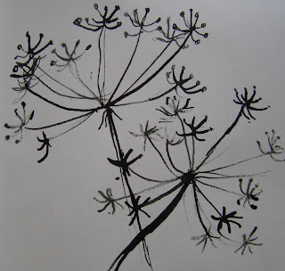
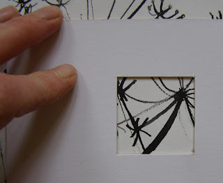
 Starting with one of the original drawings, cut yourself a viewfinder from card. This can be any size or shape you like but because my sketchbook is quite small my viewfinder is only about 4cm square.
 Move the viewfinder around over the drawing to isolate interesting areas.
 When you are happy with an area, take a sheet of tracing paper and trace what you see through the viewfinder. Repeat this process as many times as you like.
 Then trace the designs back into your sketchbook.
 Because my original drawing was quite detailed my traced drawings still retain the feeling of seedheads, however this process can produce some really abstract designs.
 Now the fun part! Make several photocopies of the traced designs so you have plenty to work with.
 And doodle or work into these photocopied sheets in any way you like... perhaps with a black pen to produce strong graphic designs.
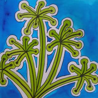
 Or with coloured felt tip pens, to give completely different effects. (Colour scheme for Gill!) If you don't like what you do you can throw it away and start on a new sheet. And those you do like can be stuck into your sketchbook.
 It may be that none of these designs suggest further ways forward, but this doesn't really matter. The process of exploration, allowing yourself time to play is what's really important. And just occasionally you'll come up with an idea that you'll want to take further. I would quite like to turn this into a print onto fabric...
But that might just be because I was inspired by this fabulous exhibition which is running until October. Worth a visit if you are in London.


More fabulous ideas Gina! I can't wait to show the children! lucy x
ReplyDeleteOh my word. I love that last image.
ReplyDeleteSuch a great idea thanks Gina. Makes me want to rush off and do some of my own right now. I have often wondered of how to progress when you hit that blank wall. x
ReplyDeleteWhat a great idea! I have an 11 year old who likes drawing and doodling and this is something she'd definitely find interesting. Thanks for that.
ReplyDeletewow, super ideas Gina. I love the little black line drawing squares they do look really abstract and would look amazing as a set of canvases on a large wall.
ReplyDeleteWhat a great idea the 'viewfinder' is. This will work for jewellery as well.
ReplyDeleteGreat ideas for working in your sketch book. I am going to buy a new book and have a go!
ReplyDeletejust a thimbleful...
ReplyDeleteIt is years since I did this excercise - what fun! Much better than tidying the study.
I'm sure my C&G tutor taught us things like this many moons ago, and I have forgotten all about them! Thankyou for reminding me. I love your doodles as well as the colour studies - lots of ways to move forward here.
ReplyDeleteI have so been enjoying all these project pages - they have really got me going!!!
ReplyDeleteMy plan is next week to do all of these exercises. Well that's the plan!
ReplyDeleteSorry, your blog no longer makes it through the firm's firewall. Clearly this says something about it's content - someone in IT security has obviously got it marked down as unsuitable for the public domain.
ReplyDeleteAnyway, having not logged on for over a week, I can see why that might be - I was quite shocked to find entries marked sketchbooks and no references to food - where have all the cake photos gone? Will they be returning soon? Help!
I have just been over to Lucy Lockets blog ,and wondered where she had seen all the great ideas ,especially the view finder ,what a super idea Gina ,love it ,Thankyou soo much for my present I got them yesterday ,and like Lucy I was delighted ,I have blogged about it today if you care to pop over for a look I would be honoured ...love Jan xx,
ReplyDeleteGreat ideas, and I love your final design, such fun :-)
ReplyDeleteGina, I was happy to learn of you from Lucy Locket. Been enjoying a wonderful visit to your blog and look forward to stopping by again. Viewfinder idea is priceless, I think I could do that. Thanks for the inspiration.
ReplyDeleteMore great design ideas Gina and good sources to use for the Sketchbook Project too (I need to get motivated!) I like the final design too.
ReplyDeleteI feel a certain amount of proprietorial pride in the Horrockses exhibition, possibly because it was part and parcel of my childhood growing up in Preston...but stupidly when said exhibition was at the local Museum I didn't go to see it.
ReplyDeleteMy Mum alway wanted a' Horrockses' dress, but made do with making her own from their fabric.
Thank you for laying out the steps to creative play. I tend to stick with realism but longed to try something new. Your steps are clear and precise and I might even try it myself! You are an inspiration Gina!
ReplyDeleteYou make it look so easy!!!! Just the thing to get me thinking though - it's lovely!
ReplyDeleteA great exercise - I must try this on the weekend - so easy to fall out of the sketching habit, but you have made it look so interesting with the process - thanks heaps :)
ReplyDeleteNot up to this yet Gina but I have been having fun, it is on my boots and sketchbook blog. Penny
ReplyDeleteLove the bottom image, so clear, uncluttered and fun!
ReplyDeletewhat a sensational idea!
ReplyDeleteI looked at the pics without reading the words and the last image leapt out as a fabric design - glad to see you think so too!
ReplyDeleteSpoonflower?
Fabulous Gina. I can't wait to finish off all my various challenges and follow your lessons. Takes me right back to collage and I love following exercises such as these. I feel another new sketchbook coming on ...
ReplyDeletecollege
ReplyDelete