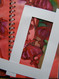
In the sketchbook project last year, I suggested using a small viewfinder to isolate areas of your drawings. Another more flexible way of doing this is to use two "L" frames.
Take any one of your previous sketchbook pages.
And move your "L" frames over the page until you find an area you like. The advantage of using the "L"s is that you can change the size and shape of your selected area.
I am trying to isolate areas that are approximately the same proportions as my original page as I want to be able to enlarge the selected area to fill a new page in my sketchbook.
When you have found the area you like take a piece of tracing paper and copy the area of the design isolated by your frames.
We are going to use this tracing to enlarge your selected area. To do this you will need to draw a grid of squares over your tracing. Mine are approximately 2cm square in a 3 x 6 grid.
Then draw a similar grid into your sketchbook but enlarge the squares - this time mine are 4cm square.
Then square by square copy the small design into the larger squares.
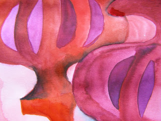
The next step is to try to reproduce the colour from your original design. This can be tricky if your original page is in your sketchbook and you are trying to work in your sketchbook at the same time, so use a photograph if that helps. You are not aiming for an identical reproduction but to capture the essence of the original. Feel free to exaggerate or emphasis the colour too.
There are a couple of reasons for this exercise - first of all it makes you really fill up that page with your design, taking it right off the edges. I think this is still something most people find quite difficult as we like to fit things neatly inside the edges of our book. So today's main challenge is to take it off the edge!
And it is also a chance to really look at the colour up close and in detail. Last time I spoke briefly about introducing some complementry colour to give some dynamics to your designs... hence the green above. But complementry colour can also be used to create darker areas without resorting to black. All the shadowy areas below are created by adding green to the red which creates a softer more natural looking shadow whereas adding black tends to deaden areas of colour.
You can see in the chart below the enormous range of colours we can achieve just by mixing each colour with its complementry.
I also spoke last time of tints and shades... a tint is a colour mixed with white.
And a shade is a colour mixed with black.
Really focus on the process rather than the end result. Look closely at the shapes and the colours and think about filling the page. The fear of "getting it right" can be really inhibiting but try not to think like that because there is no right or wrong way of doing this. Don't be afraid of messing it up!
To see more sketchbook work from other bloggers visit:
Angela and
and leave them encouraging comments. It's a brave thing to expose your sketchbook to the world!


wonderfully instructive Gina! very much enjoyed reading this post.
ReplyDeleteThat's inspiring!
ReplyDeleteI love mixing colours - I might just play with my paint box tonight :-)
Celia
x
Oh Gina, I LOVE your sketch book! If it ever disappears you'll know where to look!
ReplyDeleteThanks for encouraging words about Henry, we are cautiously optimistic at the moment, Penny x
Delightful stuff - it is great to see the way you develop your ideas, that's my achille's heel.
ReplyDeleteI must get back to work on my sketchbook or I'll fall behind everyone else. This post has reminded me of things I have been taught on various courses, but had forgotten! Definitely a case of 'use it or lose it'. Those colour studies are fascinating.
ReplyDeletewonderful sketchbook Gina....looks like you had fun!
ReplyDeleteIt's so funny that you mentioned tints and shades today -- I was just looking over some notes an hour or so that said exactly that (+ tone which is color mixed with gray). Very informative Gina -- a fun read!
ReplyDeleteIts 8am and your sketchbook blog is inspiring me to get out my brushes!! thank you for such a great workshop. See you soon xx
ReplyDeleteColour mixing is total magic. Your post is inspirational, thank you.
ReplyDelete"It's a brave thing to expose your sketchbook to the world!"
ReplyDeleteI don't sketch. But I write. And I totally get that.
Cheers :)
Loved reading and viewing here this afternoon.
Gina, you are an inspiration! I'm itching to revisit my sketchbook for the first time in nearly a year :-)
ReplyDeleteHave you ever used ecoline inks?
Your poppies are beautiful. This is such a good post you have explained it all very clearly so that even I can understand it. All I need now is some tracing paper.
ReplyDeleteMy potato is still in the fridge waiting for me to do the printing.
Brilliant idea for taking it off the edge of the sketchbook and I love the deep, vibrant colours.
ReplyDeleteThanks Gina. Came back from holiday to find your sketchbook posts. It has inspired me to get out my sketchbook from last summer, there were lots of ideas I still wanted to explore, but other things happened! Have been working on it all week, and loving it. Looking forward to starting on this year's project!
ReplyDeleteOh, i love it - I can't wait to do this!
ReplyDeleteWe're back from holiday and I'm pleased to say, our plans for the coming week have changed - I thought we'd be straight off again for a few days in Brum but we're home for the whole week and I'm going to indulge myself with lots of creative doings :o)
xxx